American University
Document Design
Campaign Design
Art Direction
The American University Office of Human Resources run Open Enrollment each year during the first two weeks of November. In order to help faculty and staff prepare for the event, we designed three long-form documents to spell out all benefits. These documents were the general Open Enrollment Guide, the COBRA Open Enrollment Guide, and the Retirement Open Enrollment Guide.
In order to help refresh the look, we went with a circular design to embrace the feeling of a circle of wellness and health, and went with the University’s AU Blue color to evoke the feeling of health and security. We were asking ourselves:
“How can HR at American University make all staff and faculty aware of their Open Enrollment benefits in way that is engaging and reflective of what is provided?”
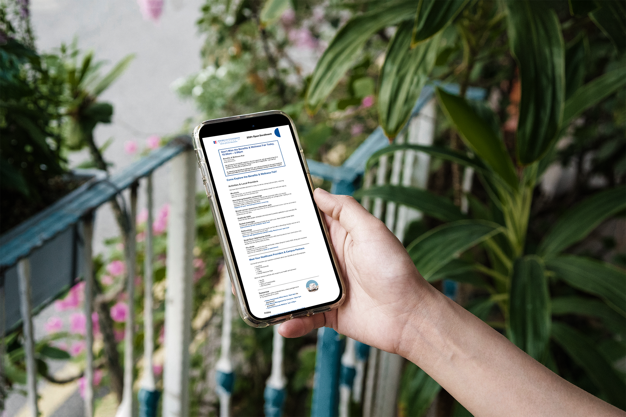
The final campaign included various assets, including digital and print assets, accesible interactive PDFs, and email marketing campaigns.
In order to help refresh the look, we went with a circular design to embrace the feeling of a circle of wellness and health, and went with the University’s AU Blue color to evoke the feeling of health and security. We were asking ourselves:
“How can HR at American University make all staff and faculty aware of their Open Enrollment benefits in way that is engaging and reflective of what is provided?”
The final campaign included various assets, including digital and print assets, accesible interactive PDFs, and email marketing campaigns.

Process
Since Open Enrollment only happens once a year, it’s crucial that all pertinent information is provided to staff and faculty, so that they can make informed decisions with their health.
In order to prepare for the mass amounts of information we had to present, I sketched out several ideas for parent pages that we would be using across the documents. Each parent page featured ways to display information, pull out definitions, charts, and more.
In order to prepare for the mass amounts of information we had to present, I sketched out several ideas for parent pages that we would be using across the documents. Each parent page featured ways to display information, pull out definitions, charts, and more.


Results
By creating strong parent pages and a strong communications timeline that had cohesive branding across the entire way, we were able to increase enrollment to informational sessions by 50%.