Keeper
Branding
Digital Design
Packaging Design
An exploration into a brand that asks:
“How can we design a brand that allows people to pursue grieving on their own terms and in their own way that is friendly, supportive, and caring?”
“How can we design a brand that allows people to pursue grieving on their own terms and in their own way that is friendly, supportive, and caring?”
Process & Solution
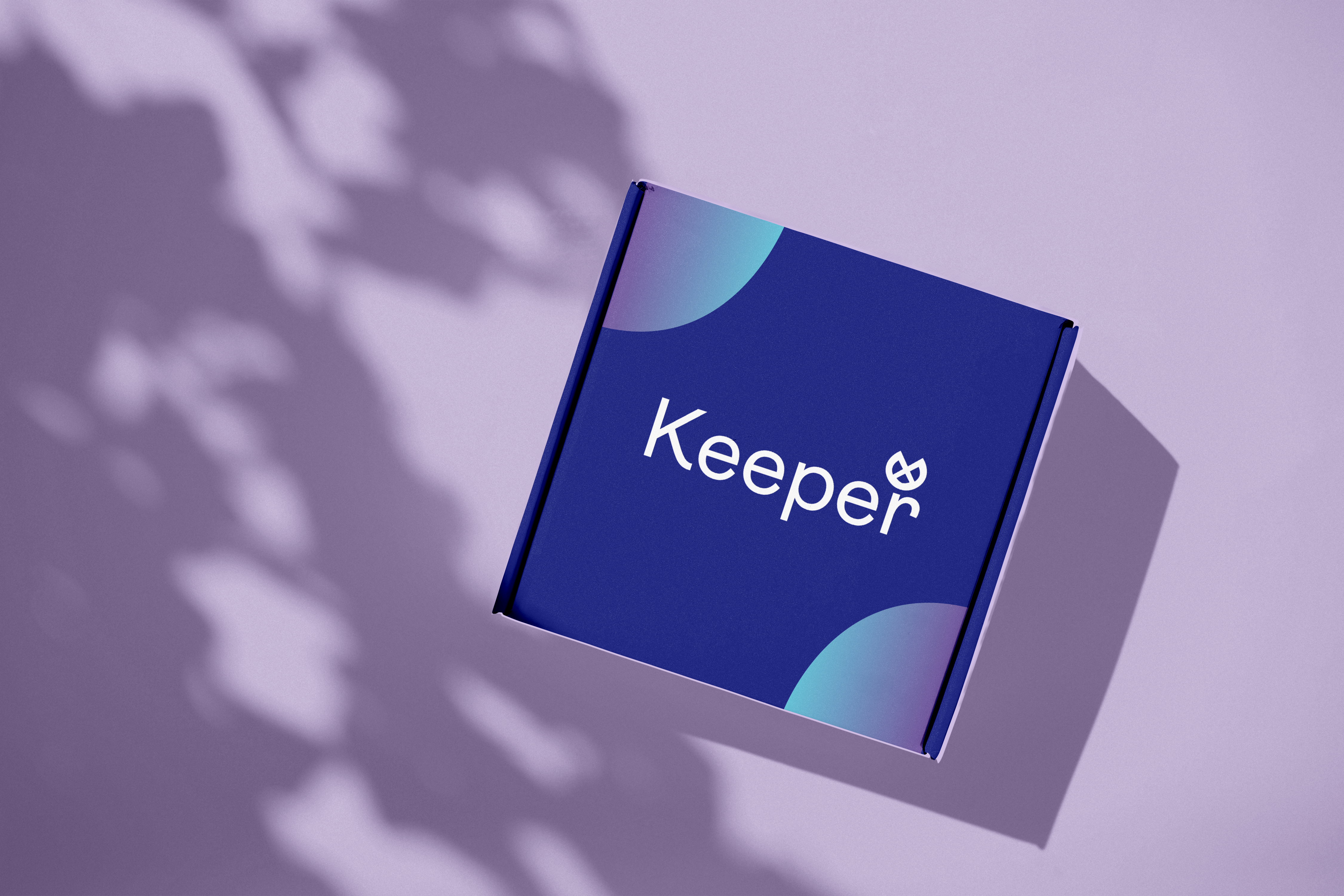
Since everyone handles grief differently, I created an abstract logo, name, and visual elements to allow for an open interpretation for anyone encountering the brand. These included a logo created from the eye of the “e,” gradients that radiate outwards and an analogus color palette with a neutral accent. The name “Keeper” was chosen to reflect the mission of keeping the memories of lost ones alive.
Brand Application
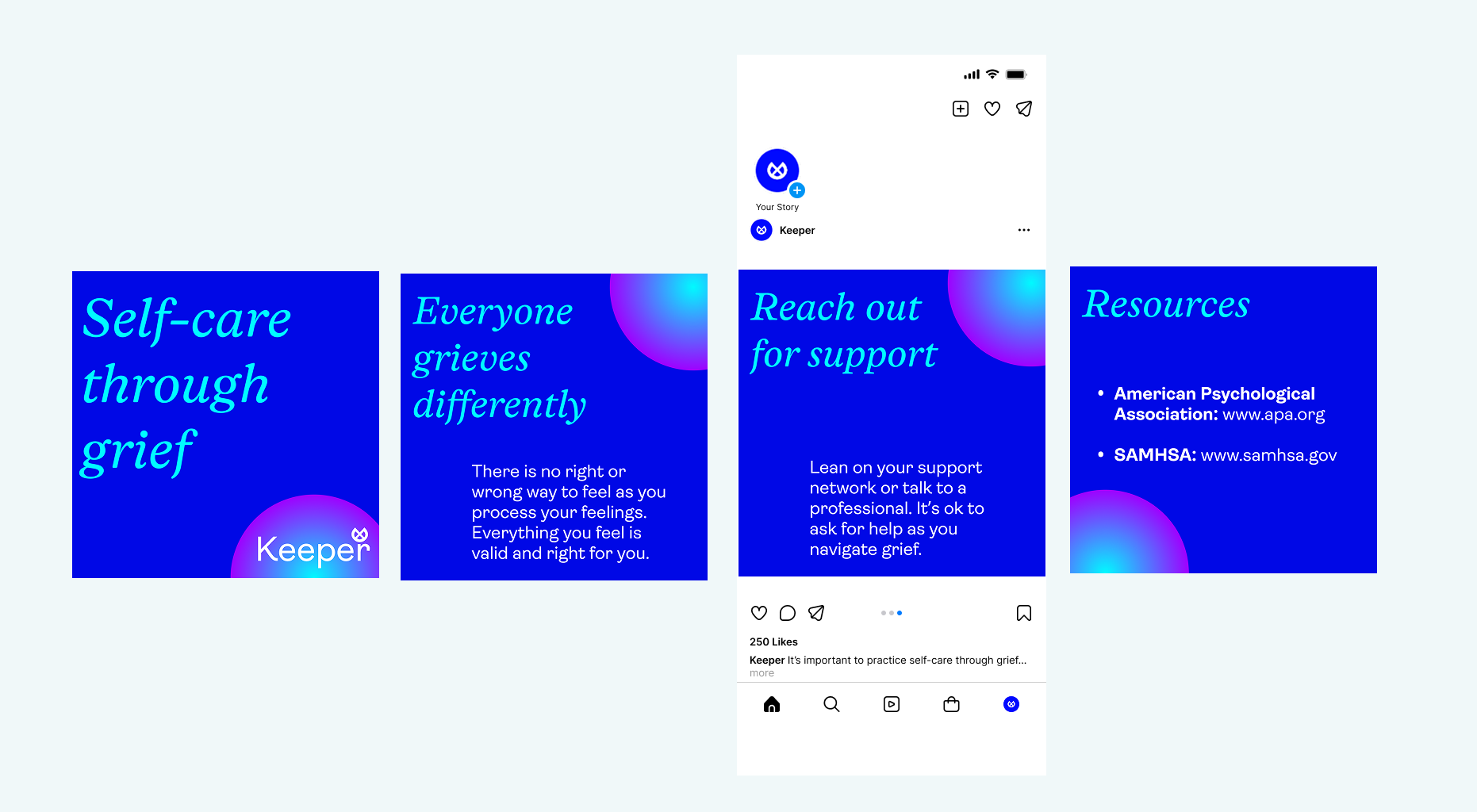
An easy to use template was created for social media posts. The gradient colors can be changed with other brand colors. A clear hierarchy on each slide allows for easy to read and concise communication that doesn’t overload the slide.
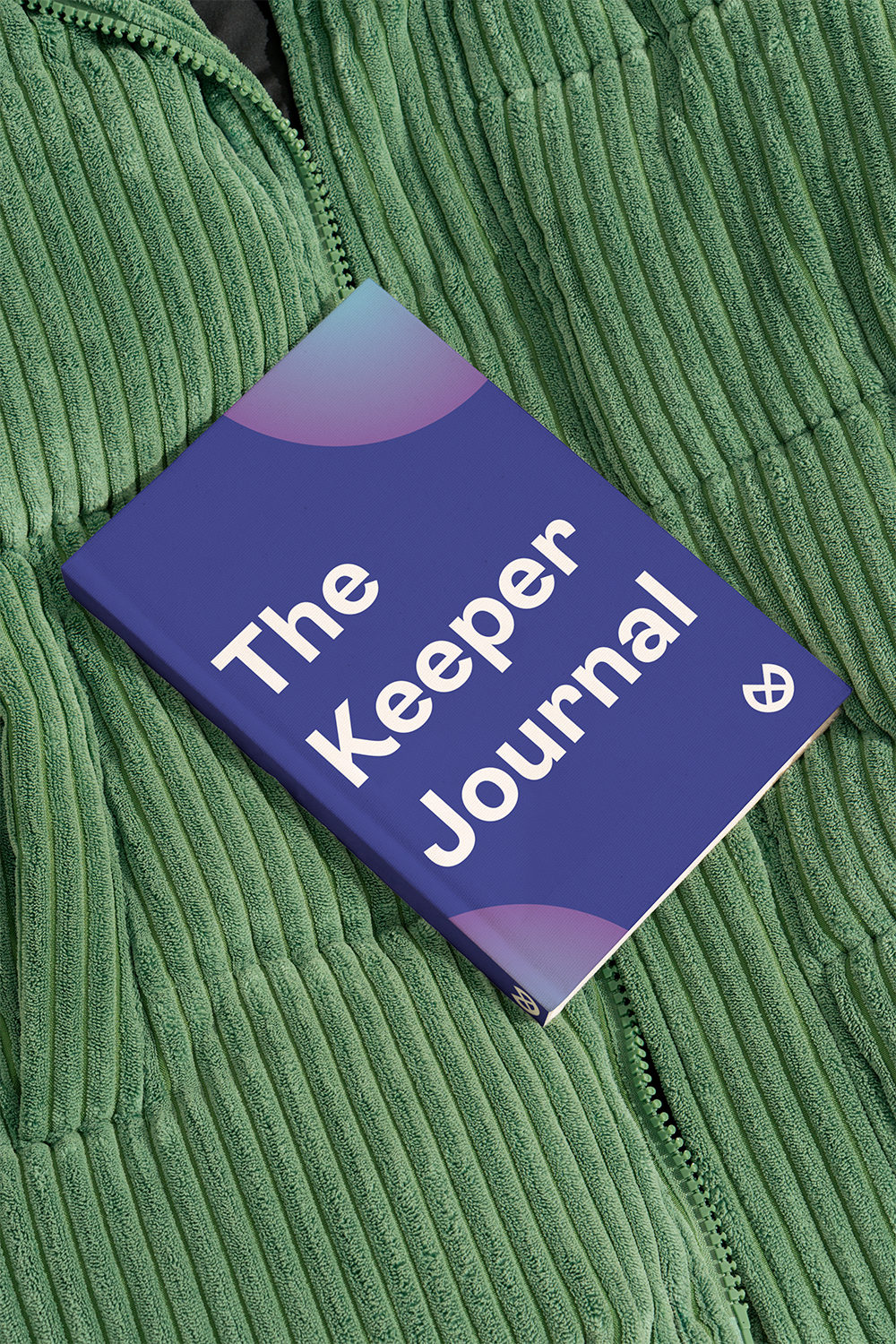
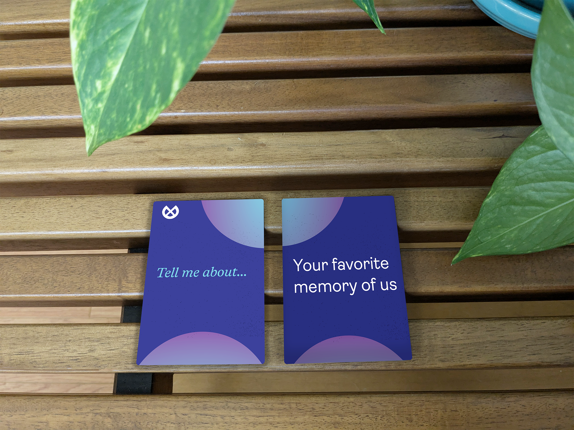
Other designs included assets that are aligned with the brand including journals, packaging, and a deck of conversation cards for people to use with loved ones.
Other designs included assets that are aligned with the brand including journals, packaging, and a deck of conversation cards for people to use with loved ones.